14 Clear and modern font pairings for your Squarespace website
Squarespace offers a wide range of fonts for you to choose from for your website, so making your selection can feel a bit overwhelming. In this blog post, I have selected 14 of my favourite clear and modern font pairings that work well together, so you can choose any of these and feel confident that your website will look professional and be easy to read.
Fonts are broadly categorised into serif and sans serifs. A serif font has small decorative lines at the end of each letter, whereas sans serif fonts do not. Serifs evoke a sense of formality, history and tradition, and are commonly used in printed books, newspapers and legal documents. Sans serif fonts, on the other hand, offer a cleaner and more modern, streamlined look; they are often easier to read on digital screens, so are widely used on websites and mobile applications. Serifs and sans serifs combine well together to provide a good contrast. My personal preference is a serif for the heading font and a sans serif for the body text, as I find this easier to read and the serifs can offer some interesting embellishments when viewed at the larger heading size.
Fonts have a personality, so you will need to consider your brand’s values and personality traits when making a selection. For example, is your brand playful, luxurious, authoritative, traditional, friendly, etc? Choose elegant thin serifs for sophisticated, feminine and luxury brands or geometric sans serifs for modern, tech-forward brands.
Tips for selecting and configuring fonts for your website
You want to select fonts that provide contrast (in weight, size or style) AND also visual harmony (shared visual features such as similar proportions or character shapes).
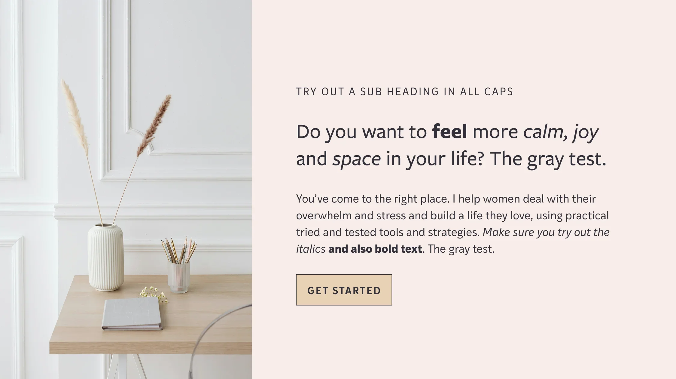
Fonts in the same family work well together, for example Freight Neo Pro and Freight Sans Pro in my first example.
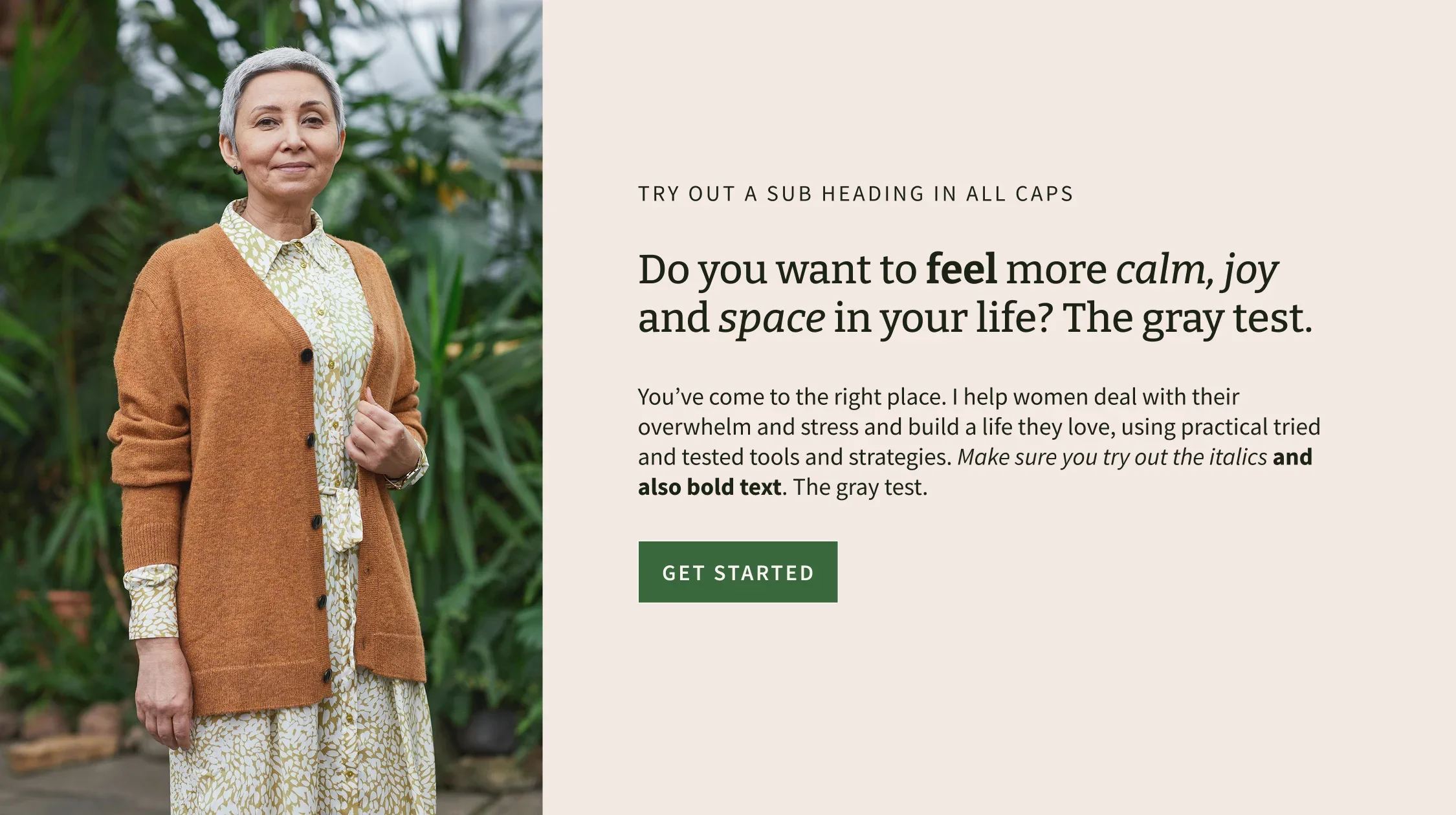
Look especially at letters a, g, y when pairing your fonts - if the header and paragraph fonts have very different versions of these, it can look odd and a bit jarring. You want something that feels harmonious. I use what I call “The gray test” in my mock-up text so I can compare these letter forms in the heading font vs. the body font. Look at my examples below and you will see what I mean!
As a general rule of thumb, two fonts should be enough for most websites: one for your heading text and one for your body text and buttons. It gets very distracting if you have lots of different fonts and sends mixed messages about your brand and identity. That said, there can be times when another font is called for:
Sometimes the font you have selected for your main paragraph font is too wide to use on buttons, so you may need to choose a slimmer font for your buttons. But if you choose a similar font, this won’t be noticeable to most viewers.
Sometimes you might want to choose another font to use for quotes. It can work quite well to use a serif font for quotes if you have sans serif fonts for your heading and paragraph fonts. But if your font choice for headings has a good italic, then this is often perfect to use for quotes.
Other times you might want to use a script font for a relaxed sub-heading. But these can be hard to read, so use sparingly.
Look at how wide the letter forms are - pairing a narrow condensed font with a wide font can look awkward.
Make sure that the font has italics and plenty of different weights - not all fonts do.
Play around with the size of the fonts, the weight and the spacing between letters, as this can have a big impact on legibility. Fonts vary a great deal in their size and how much space is between the letters. For sub-headings and buttons it can be helpful to use ALL CAPITALS and space the letters out to create some contrast with the rest of the text. See my examples below.
It can be helpful to create a style page on your website that’s not visible to outside viewers but lets you see what the fonts look like in different blocks, as bold, italic, on forms, on buttons, all capitals, with backgrounds etc. Even if you don’t create this, you need to make sure you have plenty of text on your website so you can evaluate the fonts you are trying out. If your website is already live, then make a copy of it before you start experimenting with fonts, so you have a safe playground offline to try things out.
Now that’s quite enough preamble from me - let’s get on and show you my 14 favourite font pairings for your Squarespace website.
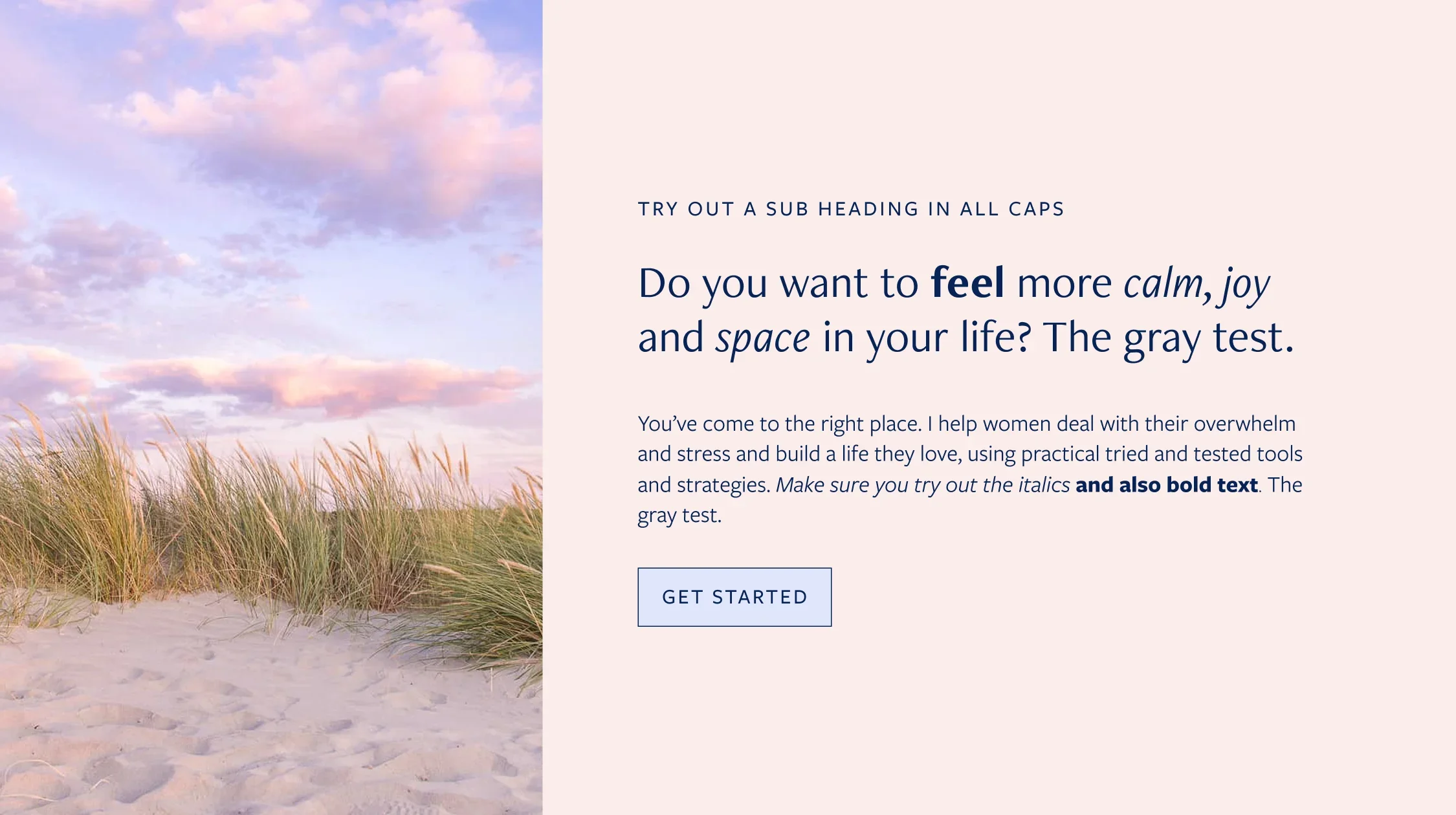
Freight Neo Pro + Freight Sans Pro
Freight Neo Pro for headings and Freight Sans Pro for body text and buttons. Freight Neo Pro is a sans serif but with a hint of a serif - it feels professional yet approachable and modern. You can see it in use in my Nourish Template Demo Website.
2. IvyMode + IvyStyle Sans
IvyMode for headings and IvyStyle Sans for body text and buttons. IvyMode also hints at a serif and offers contrasting thick and thin strokes and diamond-shaped dots and punctuation. The bold is especially thick and great for emphasis. It feels classy and elegant yet modern. You can see it in action in my Alana Template Demo Website.
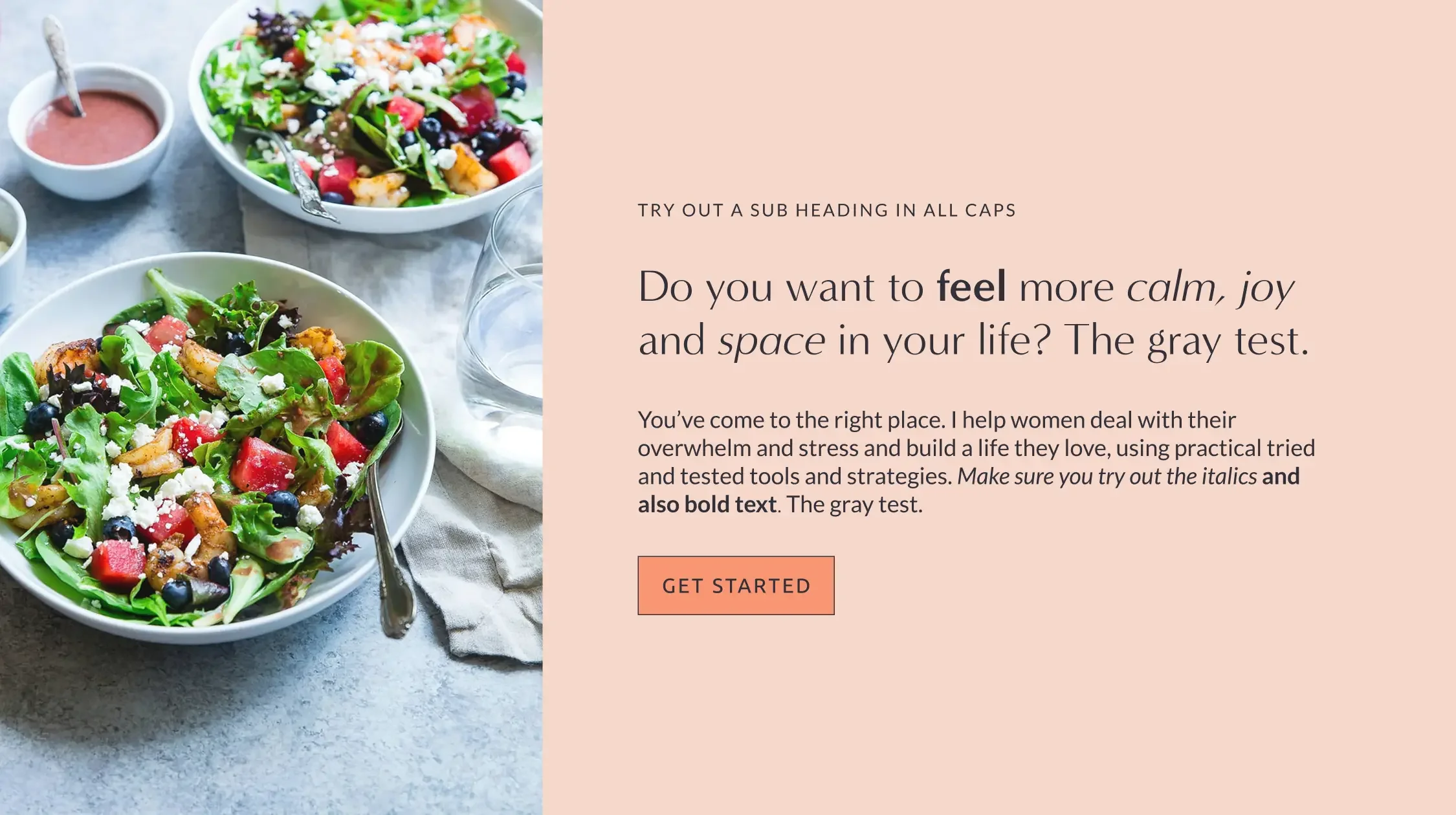
3. Minerva Modern + Lato
Minerva Modern for headings and Lato for body text and buttons. Minerva Modern shares some similarities with IvyMode above in terms of the contrasting thick and thin strokes and an elegant feel. The effect is subtler, though, and the font looks especially lovely in all capitals. It has a friendly yet professional and modern feel. You can see it in action in my Abigail Template Demo Website.
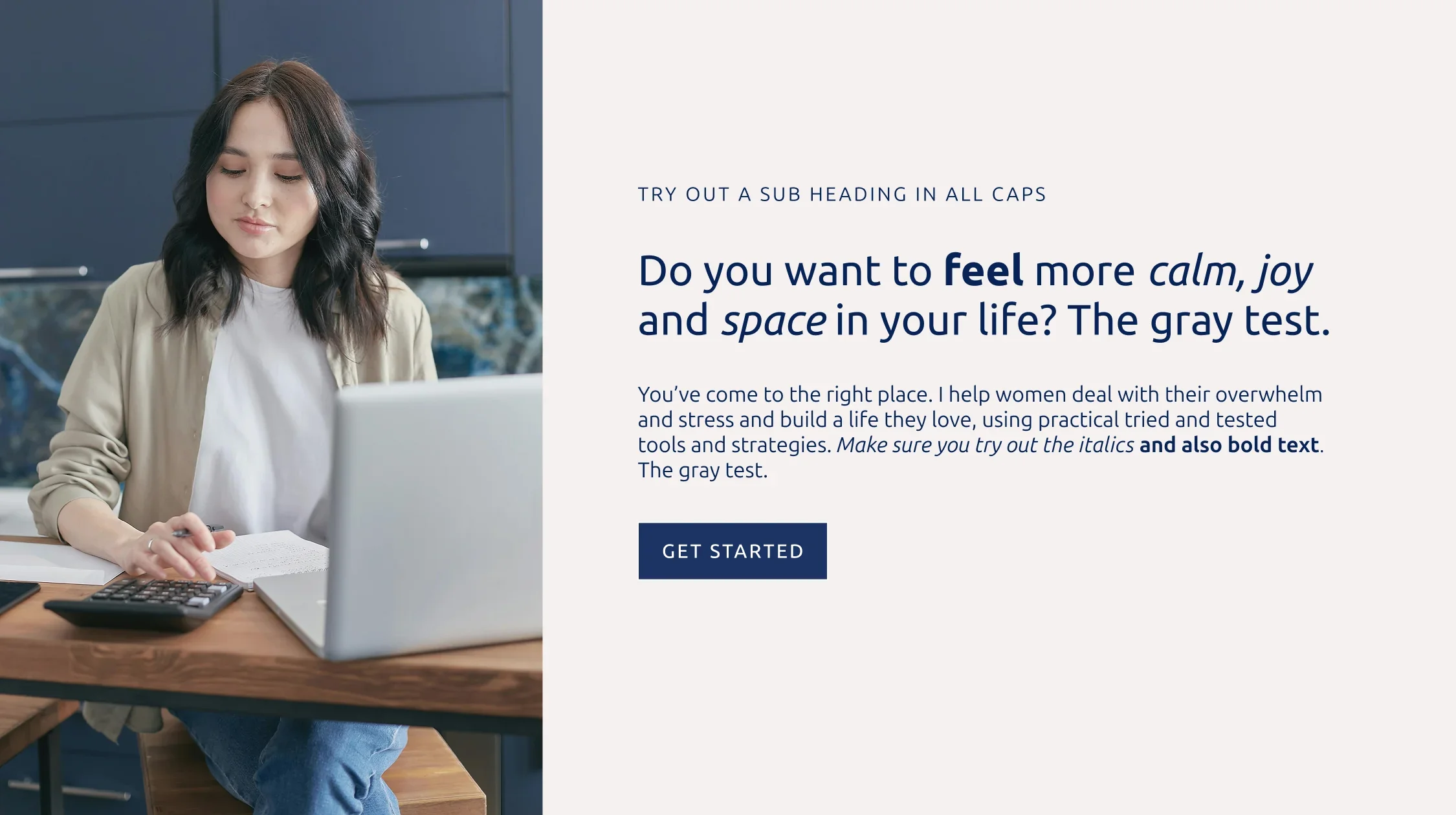
4. Ubuntu + Ubuntu Sans
Ubuntu for headings and Ubuntu Sans for body text and buttons. Ubuntu was developed as the font for the Ubuntu operating system and designed for clarity on screens. Its slightly square letterforms are suggestive of technology, but its clear, friendly, modern form makes it appropriate for a wide range of uses.
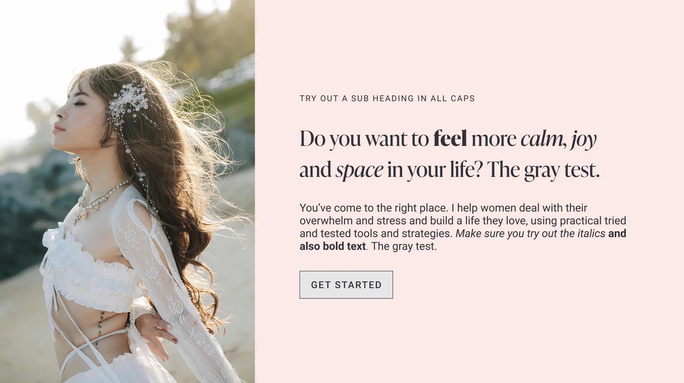
5. IvyPresto Display + Roboto
IvyPresto Display for headings and Roboto for body text and buttons. IvyPresto Display is a beautiful and popular serif typeface with a feminine and elegant, professional feel. It has a really chunky bold that provides great contrast and emphasis and is designed to be displayed at larger font sizes, making it perfect for headings. Its narrow proportions pair well with Roboto, which is similarly narrow, despite having a different “g” letterform.
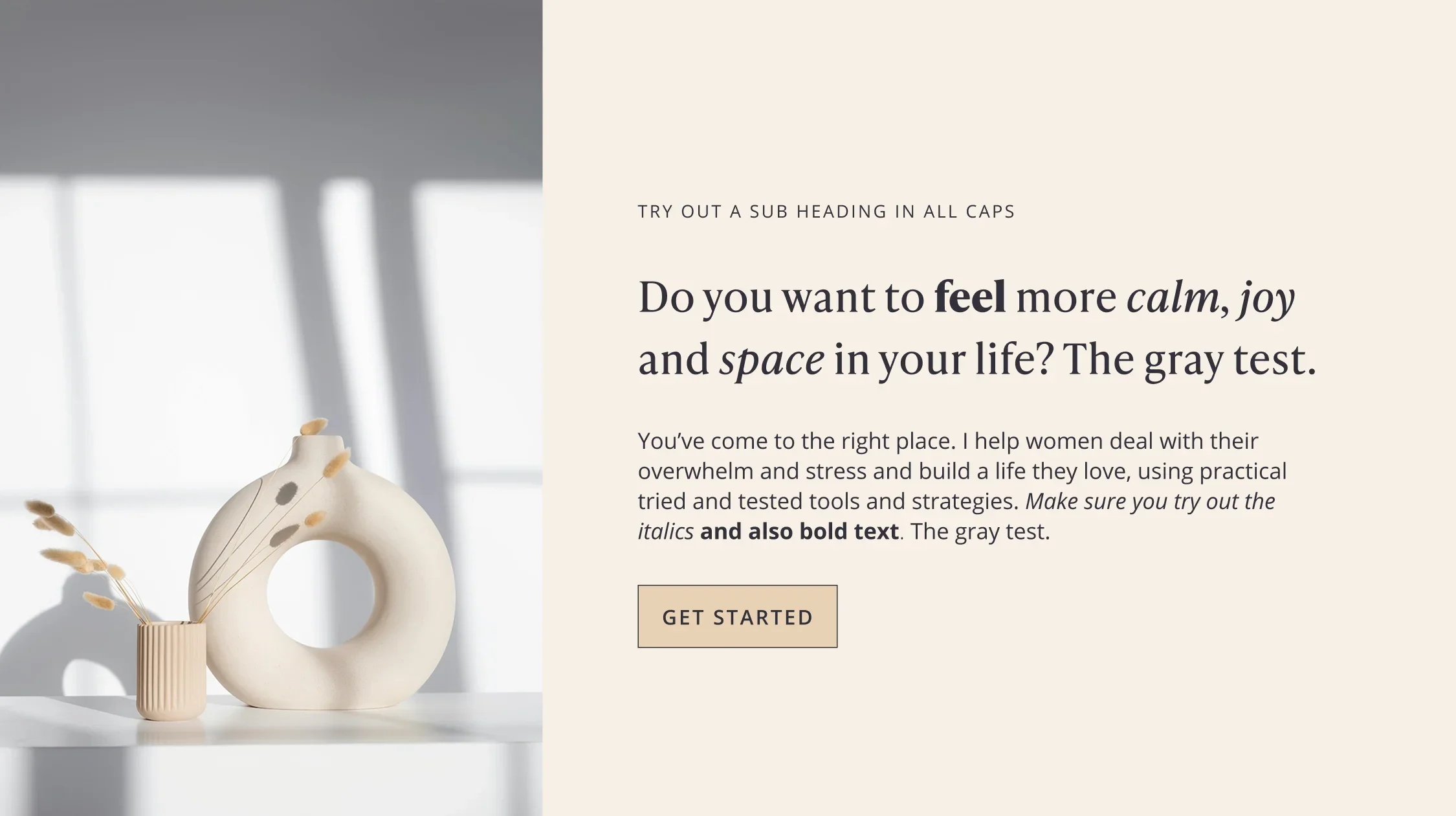
6. IvyPresto Text + Open Sans
IvyPresto Text for headings and Open Sans for body text and buttons. Another font from the Ivy Foundry (you can see I’m a big fan!), IvyPresto Text has many similarities to IvyPresto Display above, but was designed to be more legible at smaller font sizes. It is a little more restrained and neutral than the display version, but still has that chunky bold. It feels professional and approachable.
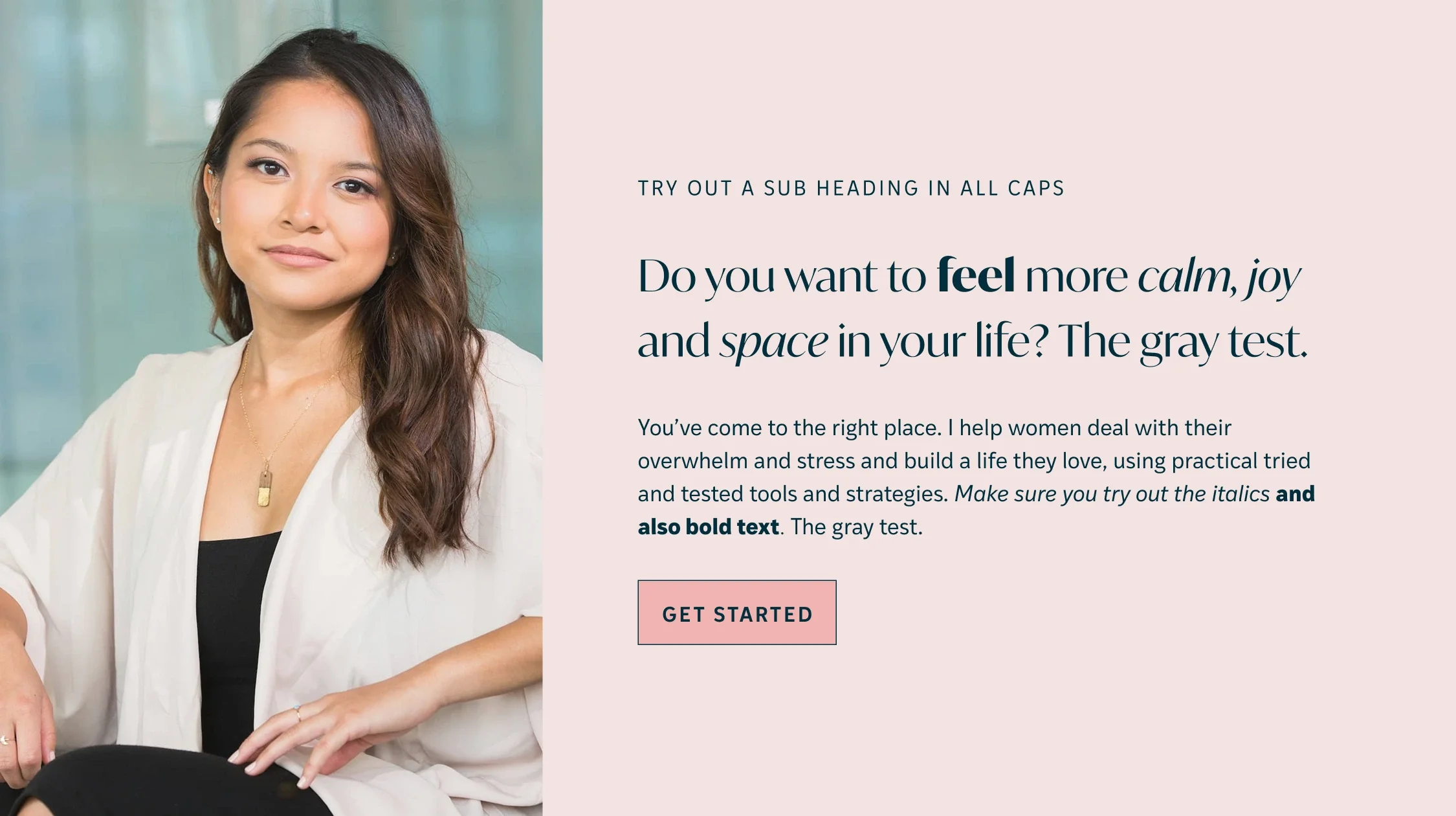
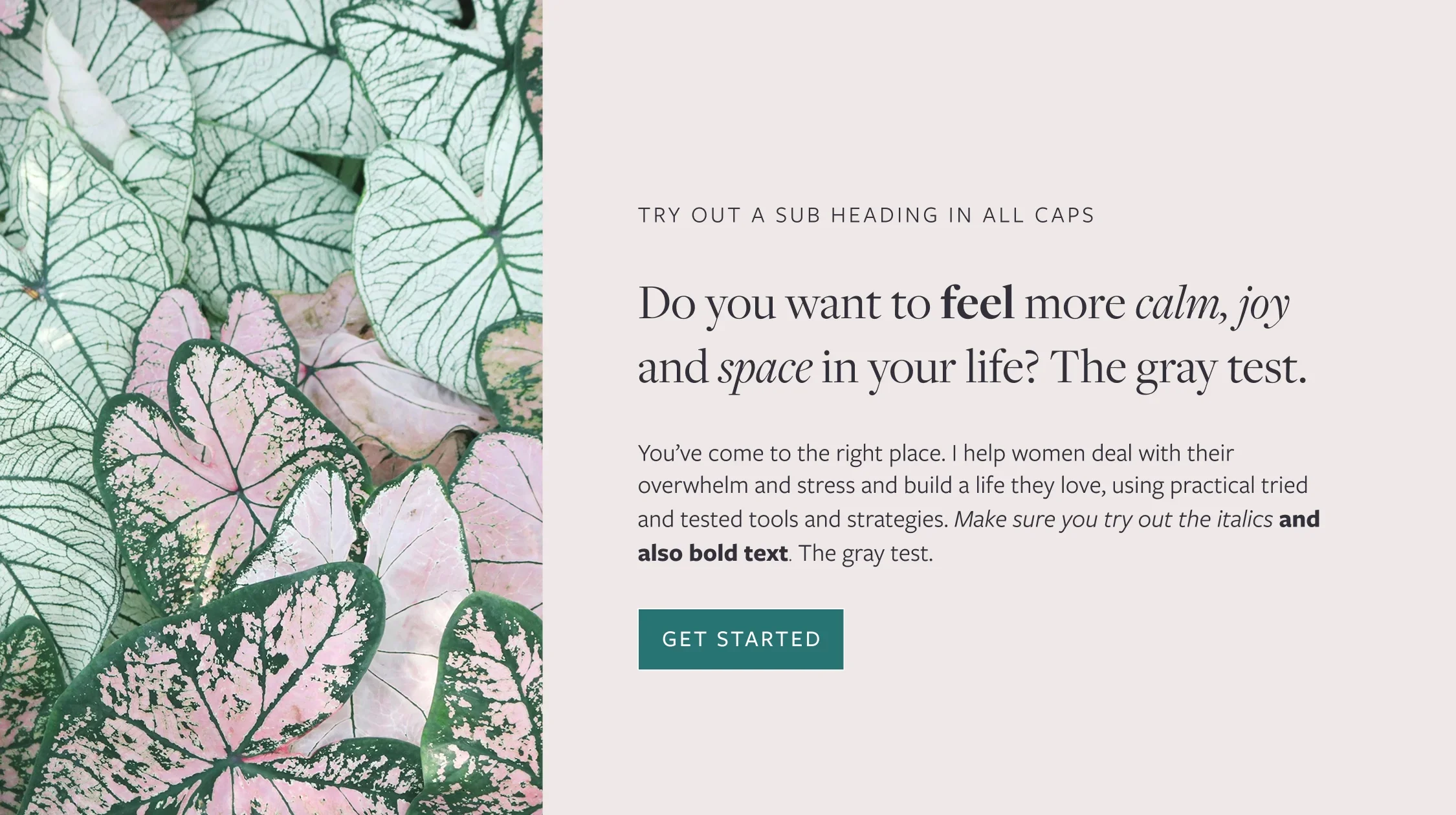
7. Freight Display Pro + Freight Sans Pro
Freight Display Pro for headings and Freight Sans Pro for body text and buttons. Freight Display Pro is another elegant, sophisticated feminine serif with some lovely italics. As a display font, it is intended to be used at larger font sizes for headings, and wouldn’t be legible as body text. It pairs well with the clean simplicity of Freight Sans Pro from the same family.
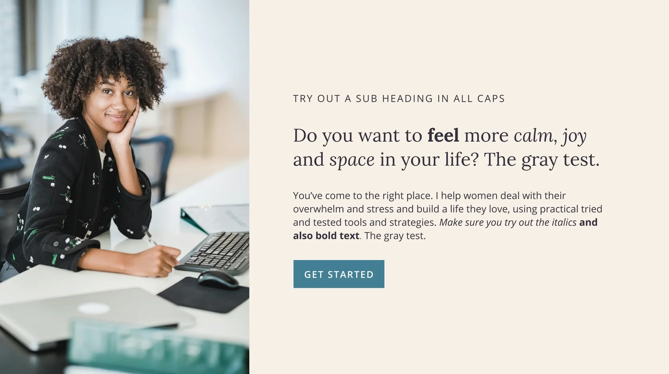
8. Lora + Open Sans
Lora for headings and Open Sans for body text and buttons. Lora is a contemporary, elegant, well balanced serif font that works well both as a heading font and for body text. It’s a very versatile font that feels approachable and confident and will work for a wide range of brands and businesses.
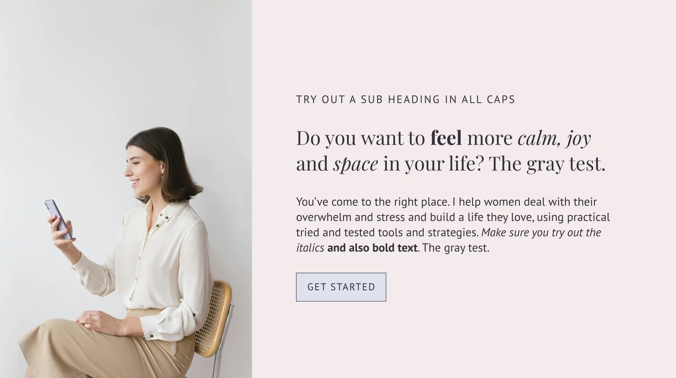
9. Playfair Display + PT Sans
Playfair Display for headings and PT Sans for body text and buttons. Playfair Display is another elegant serif that feels refined and luxurious. It feels both classic and modern and has some lovely playful flamboyant italics that provide great emphasis. It is a popular choice for lifestyle, fashion and luxury brands. As a display font, it works well for larger headings, but not for body text.
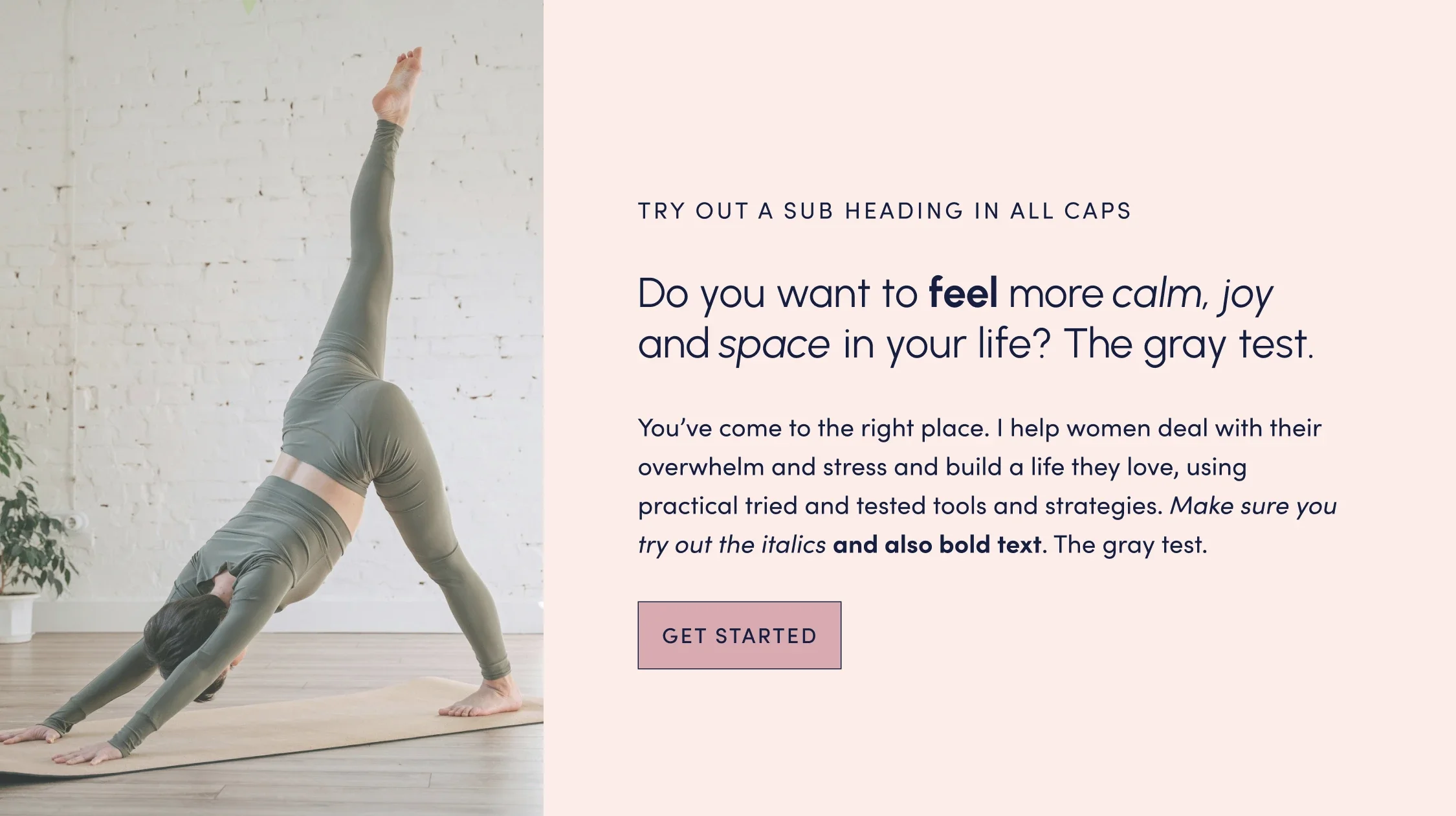
10. Urbanist + Sofia Pro
Urbanist for headings and Sofia Pro for body text and buttons. Urbanist is a modern, minimal geometric sans serif with a feeling of space and clarity. It’s a confident, bold and very versatile font that would work well for contemporary brands seeking simplicity and clean, straightforward design, for example interior design, artists, technology, creative agencies, yoga studios and more.
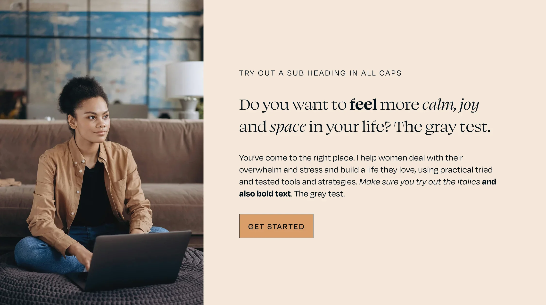
11. Swear Display + Degular
Swear Display for headings and Degular for body text and buttons. Swear Display is modern, expressive, bold, lively and confidently unconventional. It has some fabulous italics and pairs well with Degular, as both fonts have wide proportions.
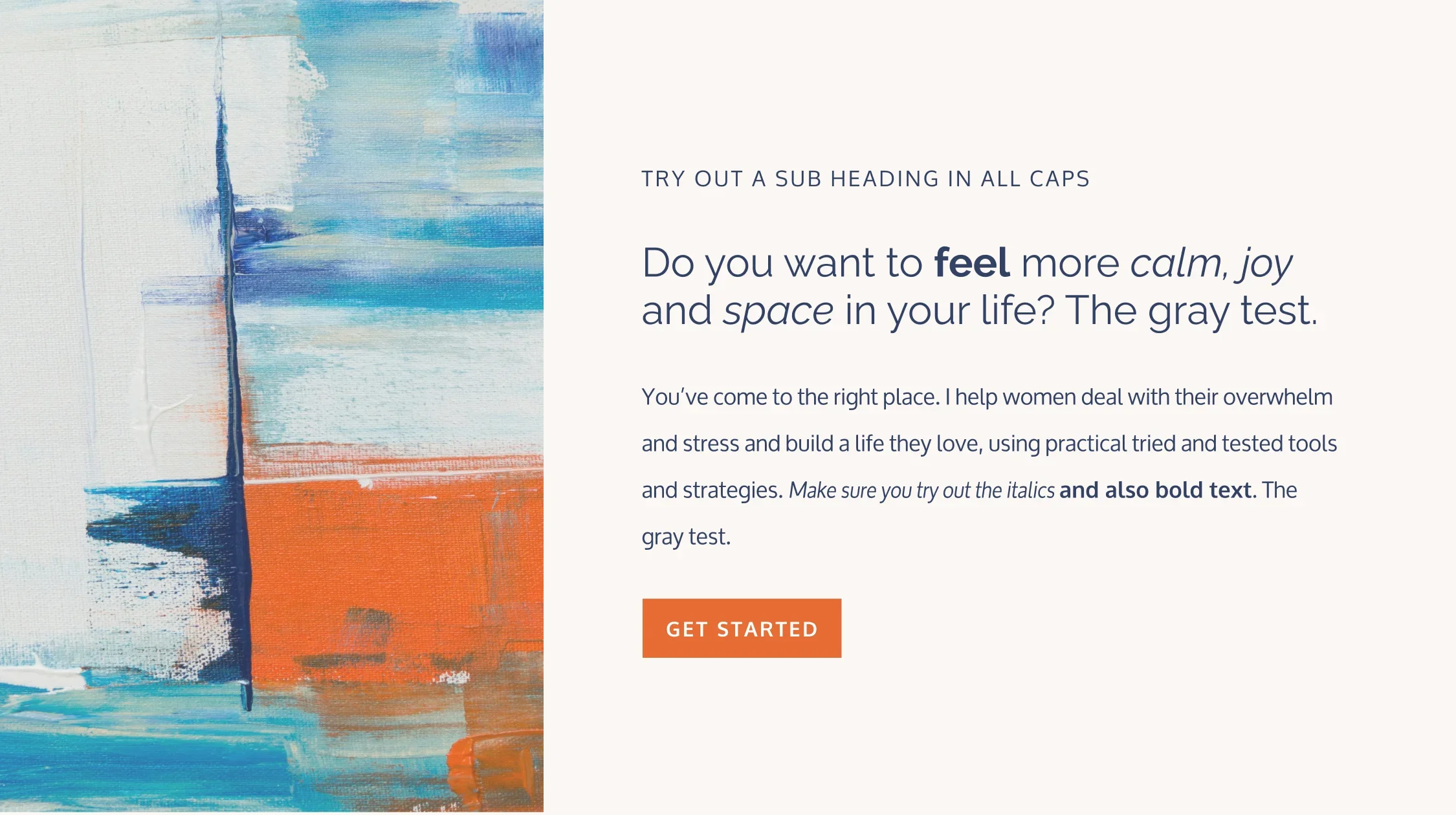
12. Raleway + Oxygen
Raleway for headings and Oxygen for body text and buttons. Raleway is another modern, minimal geometric sans serif that feels clean, elegant and versatile. Like Urbanist, it would suit high-end interior designers, artists, technology/start-ups, creative agencies, yoga studios, luxury products and many more. It is best used as a display font for headings.
13. Freight Sans Pro + IvyStyle Sans
Freight Sans Pro for headings and IvyStyle Sans for body text and buttons. Freight Sans Pro is a modern serif that is clean, balanced, approachable and professional. It is a very flexible font with a wide range of uses and makes a great body font as well as headings. For those seeking clarity and simplicity, it is hard to go wrong with Freight Sans Pro.
14. Bitter + Source Sans Pro
Bitter for headings and Source Sans Pro for body text and buttons. Bitter is a modern slab serif font. It is well balanced and highly legible at all sizes, so is well suited to body text as well as headings. It is solid, reliable, approachable and unassuming.

